Saturday, August 27, 2011

Janelle Works Over a Picture


My sister took some photos on a camping trip and a couple of them have really cool things going on with the color so I wanted to work over them. My handle on whateverthisisvectorart? is non-existent, and in a better world the figure would have a bit more movement... sleeping movement. I am trying to find a balance between shading with gradients and solid tones in harmony with photoshop.

YUP. 

Friday, August 5, 2011

Practice Makes Practice

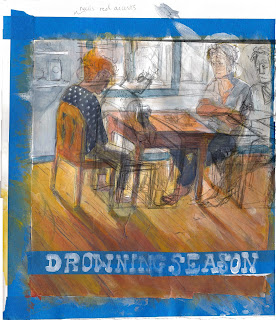
Paint texture and photoshop texture are so awkwardly different and I am not quite sure how to fffuse (is the best word I have at 2am) them.
Yeaaaaa.
Also I like to put meaningless text on this, what up.

Sunday, July 24, 2011

Work In Progress


Multiply + mess with opacity = the only things I am capable of in photoshop right now... honestly.

Tuesday, July 5, 2011

Woof Bear

Super fast possible coloring picture for a story about the Ursa Major 

Wednesday, June 1, 2011

Finals


So here is the second half of that there movie poster project. This one is an new design for Lucky Number Slevin - which always makes my 'favorite' list. For advertising  Lucky # Slevin generally get's the simple black and red portraits pointing the occasional handgun because that sells well and doesn't impose much on the movie. These two variations are a little more appropriate for someone who has viewed the film but are also pushing the envelope for the sake of being able to things for the hell of it in student work. Like swiping that wallpaper print from the movie instead of drawing my own, yes. 

The line work is brush in, the rest is digital... which I am trying to slowly get a handle on. 
Josh Hartnett happens to look like every dude I draw ever, so hopefully it's a convincing likeness...


Thursday, May 26, 2011

Mock Movie... Illustration

This doesn't seem appropriate for a review illustration and is out of format for a poster, either way I am playing with illustrating movies about criminals with Ben Kingsley in them without falling into the the dark color/warm color, high contrast, ultra-posterized cliche. I played with a quick turn out image for You Kill Me.

(full view is embarrassing)
Still trying to find a way to match the humor and wit of these movies.